




Last Updated: November 1, 2026
Quick Summary
Essential streetwear colour palettes for men are built on four neutral core colours, black, grey, navy and crisp white, then layered with earth tones like olive, brown and sand, and finished with one or two accents such as mustard, burgundy or royal blue. Limit each outfit to two or three colours, keep blocks large, and apply the 60/30/10 split so one colour clearly leads.
- A core palette of black, grey, navy and white gives you roughly a dozen outfit combinations before buying any bold piece.
- Keep outfits to two or three colours and let one colour lead while the other supports it.
- Use the 60/30/10 split for triadic blocking: one colour dominates at about 60%, the second at 30%, the third at 10%.
- Greenish wrist veins suggest a warm undertone suited to earth tones, olive, mustard and brown; bluish veins suggest cool tones like navy and burgundy.
- Build a capsule in three tiers: core at 60% of the wardrobe, earth tones at 25%, accents at 15%.
Table of Contents
- Why Streetwear Colour Palettes Matter More Than Logos
- Building Your Base With Neutral Streetwear Outfits for Men
- Men's Streetwear Colour Combinations That Always Work
- Monochrome Streetwear Outfits Done Right
- Streetwear Colour Blocking Without Looking Like a Colour Chart
- Matching Palettes to Skin Tone and Undertone
- Seasonal Palettes, Fabric Texture and How Colour Interacts
- Build Your Capsule Palette With Cali Studios
- Frequently Asked Questions
Why Streetwear Colour Palettes Matter More Than Logos
Walk through any city centre and count the hoodies. The logos blur together. What separates the guy who looks put together from the guy who looks like he got dressed in the dark is almost never the brand on his chest. The 2026 streetwear colour trends guide is worth reading alongside this if you want the wider picture before narrowing down to specific palettes.
Building Your Base With Neutral Streetwear Outfits for Men
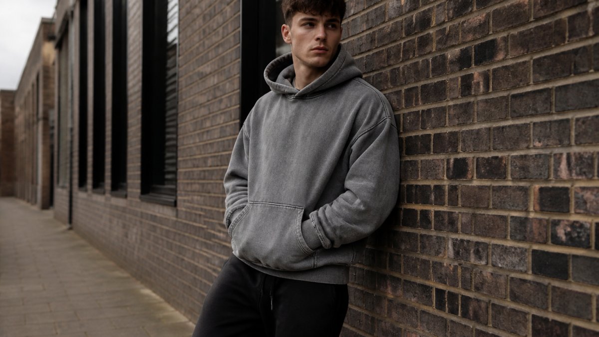
Neutral streetwear outfits for men start with four colours: black, grey, navy and crisp white. For concrete ways to apply this palette, see these minimalist streetwear t-shirt outfit ideas. These are the workhorses. A wardrobe built on them gives you roughly a dozen outfit combinations before you've bought a single bold piece, and every loud item you add later has something to sit against.
Black, Grey, Navy and Crisp White
Think of these four as your palette's skeleton. Black is the anchor: it absorbs light, reads sharp, and hides wear better than anything else. Grey, particularly washed grey, softens black without introducing a new colour.
A common mistake is treating grey as one colour. It isn't. A washed grey sweatshirt next to a charcoal jogger creates depth; a mid-grey next to a matching mid-grey creates a uniform.
Men's Streetwear Colour Combinations That Always Work
The combinations that never fail are built on contrast: one bold piece against a neutral base, or two earth tones layered in different textures. Men's streetwear colour combinations work best when you limit yourself to two or three colours per outfit and let fit and fabric do the rest.
High-Contrast Pairings and Earth Tones
High-contrast pairings are the fastest route to a strong look. Black with crisp white. Navy with mustard. Burgundy against grey.
Earth tones are the quieter option. Olive, brown, sand and dark green layered together read considered rather than loud, and they suit the autumn months especially well.
For more styling examples of how graphic tees anchor high-contrast looks, the graphic tee outfit ideas guide breaks down seven combinations worth copying.
Monochrome Streetwear Outfits Done Right
Monochrome streetwear outfits use a single colour family across the whole look, varying shade and texture rather than hue. Done well, monochrome reads intentional and expensive.
The technique is tonal layering. Take grey: a light grey tee under a mid-grey hoodie, charcoal joggers below, and white sneakers to break the run at the bottom.
Watch out: all-black outfits collapse into a single dark mass in photographs and in low light.
If tonal dressing is your direction, a grey hoodie is the obvious starting point. Shop the Heavy Hoodie Grey to build a tonal outfit. The Heavy Hoodie in Grey is a grey option for this kind of layering.

Streetwear Colour Blocking Without Looking Like a Colour Chart
Streetwear colour blocking works when you treat each block as a deliberate panel, not a random mix. The technique borrows from the colour wheel, and understanding three relationships on that wheel is what separates a block that looks designed from one that looks accidental.
The Three Colour-Wheel Relationships Worth Knowing
Complementary. Colours sitting directly opposite each other on the wheel, navy and mustard, burgundy and olive, royal blue and orange. Maximum contrast, maximum punch.
Analogous. Colours sitting next to each other, navy and dark green, olive and sand, burgundy and rust. Lower contrast, softer read, easier to wear. Analogous blocking is the safer entry point because the colours already share a family.
Triadic. Three colours evenly spaced around the wheel, for example royal blue, mustard and a true red. This is the hardest to pull off and the easiest to get wrong. If you attempt it, let one colour dominate at roughly 60% of the outfit, the second at 30%, and the third at 10% as an accent (a cap, a sock, a bag strap).
Proportion Rules That Keep Blocking Clean
Three rules keep it clean. First, use no more than three blocks per outfit. Second, keep the blocks large: a full hoodie, full trousers, full shoes, rather than many small patches. Third, apply the 60/30/10 split, one block dominates at roughly 60% of the visible outfit, the second takes about 30%, and the third is a 10% accent.
A useful test before you leave the house: squint at yourself in a mirror. If you can still tell which colour is leading, the proportion is working. If all three compete equally, rebalance.
Worked Examples
- Two blocks plus a neutral (beginner): royal blue hoodie, black joggers, white sneakers. The neutral does the calming; the blue does the talking.
- Complementary pair (intermediate): navy hoodie, mustard beanie, charcoal joggers, white sneakers. Navy and mustard sit opposite each other; charcoal and white keep the base quiet.
- Analogous trio (intermediate): olive overshirt, sand tee, dark green cargo trousers, white sneakers. All three sit in the same earth family, so the eye reads cohesion rather than conflict.
Where Blocking Goes Wrong
Two loud colours competing for attention at equal proportion rarely works unless you know exactly what you're doing. The other common failure is small, scattered blocks, a red logo here, a blue patch there, which reads as noise rather than blocking. Keep blocks big, keep one colour in charge, and let neutrals absorb the rest.
Matching Palettes to Skin Tone and Undertone
Palettes look different on different people, and undertone is the reason.
A quick way to check: look at the veins on your inner wrist in daylight. Greenish veins suggest a warm undertone, bluish veins suggest cool, and a mix suggests neutral.
This isn't a rulebook, it's a starting filter. If a colour you love sits outside your suggested palette, wear it anyway, just keep it away from your face.
Seasonal Palettes, Fabric Texture and How Colour Interacts
Colour doesn't behave the same way across fabrics, and that changes your palette by season. Understanding why is what lets you rotate a small wardrobe rather than buy new clothes every few months.
Why the Same Colour Looks Different on Different Fabrics
Three mechanisms are at work.
Dye uptake and fibre. Natural fibres like cotton take dye differently from synthetic fibres like polyester.
Weave and surface. A smooth, tight weave reflects light and makes a colour look brighter and more saturated.
Wash and fade. Garment-dyed and stone-washed pieces fade unevenly, which is usually the point, a faded black hoodie reads grey-brown at the seams and near-black at the body.
A Seasonal Rotation, Not a Seasonal Wardrobe
Seasonally, autumn is often a strong palette for streetwear: olive, brown, burgundy, mustard and washed grey all peak together. Winter leans toward black, charcoal and deep navy, with texture doing much of the work. Spring and summer open up to crisp white, light grey, sand and brighter accents like royal blue.
A seasonal palette isn't about buying new clothes every few months; it's about rotating which pieces lead. The same core four, black, grey, navy, white, can anchor every season if you change the earth and accent tiers around them:
| Season | Lead earth tones | Lead accents | Texture cue |
|---|---|---|---|
| Autumn | Olive, brown, rust | Mustard, burgundy | Brushed fleece, corduroy, heavy cotton |
| Winter | Charcoal, deep brown | Burgundy, forest green | Matte vs sheen layering, nylon, wool blends |
| Spring | Sand, light olive | Royal blue, soft red | Smooth cotton, lighter jersey |
| Summer | Sand, stone | Crisp white, bright blue | Thin cotton, open weaves, high contrast |
Practical Checks Before You Buy
- Hold two pieces of the same named colour together in daylight. If one reads warmer or cooler, they're different tonal registers, fine to wear together if you vary texture, risky if you don't.
- Photograph an outfit in low light before committing. All-dark outfits collapse into a single mass in photographs and in low light; one tonal break, even a dark grey, lifts the whole look.
- Buy accent pieces in fabrics you can see the texture of. A mustard in smooth cotton reads brighter than a mustard in brushed fleece, which gives you two different tools from one colour name.
Build Your Capsule Palette With Cali Studios
A capsule palette is a small set of colours that all work together, so every piece you own can be worn with every other piece. Build it in three tiers:
| Tier | Colours | Role | Example Pieces |
|---|---|---|---|
| Core | Black, grey, navy, white | 60% of wardrobe | Hoodie, tee, joggers |
| Earth | Olive, brown, sand | 25% of wardrobe | Cargo trousers, overshirt |
| Accent | Mustard, burgundy, royal blue | 15% of wardrobe | One hoodie, one cap |
Start with the core, add earth tones next, and introduce a single accent once the base is solid. That structure gives you mix-and-match combinations without overthinking it each morning.
We built our range around this logic. The Heavy Hoodie in Navy is a core-tier piece that anchors almost any combination, and the Heavy Hoodie in Black does the same job in the darkest register.

The hardest part of dressing well isn't buying more, it's buying the right colours in the right order. Get your core palette settled first, and every future purchase gets easier.
Frequently Asked Questions
What colours are essential for a streetwear wardrobe?
Start with a neutral core: black, grey, navy and white. These four cover most outfits and pair with anything. Add one earth tone like olive or brown, then one statement colour such as mustard or royal blue. That five-colour base gives you enough range to build dozens of combinations without overthinking it. Most streetwear colour palettes for men work because the neutrals do the heavy lifting and the bold shade adds the accent.
How many colours should a streetwear outfit include?
Two or three is the sweet spot. One neutral base, one secondary neutral or tonal shade, and at most one statement colour. Going beyond three usually makes an outfit look busy rather than considered. If you want to wear something bolder like burgundy or mustard, keep everything else quiet so the colour has room to stand out. A black hoodie with grey joggers and white sneakers is two colours doing more than five would.
What colour trousers go with a black streetwear hoodie?
Almost anything, which is why black is the safest base in a streetwear wardrobe. Grey joggers give a tonal, low-effort look. Olive or brown cargos add an earth-tone contrast that reads more styled. Washed grey denim keeps it casual. For colour blocking, try navy or burgundy trousers with the black hoodie on top. The only pairing to avoid is very dark trousers in a clashing tone, which can look muddy rather than deliberate.
How can men wear colour without making an outfit look too busy?
Anchor the colour with neutrals. Wear one bold piece, such as a mustard hoodie or royal blue sweatshirt, and keep everything else in black, grey or white. That way the eye has one place to land. You can also repeat the colour in a small detail like a beanie or sneaker accent to tie the look together. If you are new to colour, start with earth tones like olive and brown before moving to brighter shades.
Are neutral colours best for streetwear?
Neutrals are the foundation, not the whole wardrobe. Black, grey, navy and white make up the base of most neutral streetwear outfits for men because they mix easily and suit every setting. But a wardrobe of only neutrals gets flat. Adding one or two statement colours, whether that is mustard, burgundy or dark green, gives you options for nights out, seasonal dressing and days when you want the outfit to do more talking.

